Youth2Seniors

A website redesign project

The problem:

Youth2Seniors has a great mission, but it is unfortunately obscured by bad UI. The website’s information architecture is difficult to navigate, the text is difficult to follow, and the unprofessional look and feel turns off volunteers and donors.

The solution:

We created a fun, yet professional website with easy volunteer sign-up and donation processes that encourage more community engagement. We also made the site responsive so that it can be viewed on mobile.

Team:
3 people
My role:
UX research, UX design
Tools:
Adobe XD, InVision, Miro, Trello

Research

We started this project by getting in touch with the Youth2Seniors founder and website creator to learn more about the nonprofit and what she we might like to see in a redesign. Here are some key takeaways from our conversation with her:

•   Senior citizens don’t use the website.
•   It’s for parents to sign their kids up to volunteer.
•   The calendar and registration pages are most important.
•   Nobody tracks their volunteer time.
•   The rewards program is defunct.
•   The website should ideally be fun and engaging, yet professional.

After speaking with her, we interviewed people who volunteer with groups similar to Youth2Seniors to understand their needs and pain points. We also asked them to take a look at  the Youth2Seniors website.

User Insight

Our interview subjects all felt pretty much the same way about the Youth2Seniors website. They didn’t immediately understand the nonprofit’s mission. They couldn’t tell what volunteering entailed. Furthermore, they weren’t sure if it was even a legitimate organization.

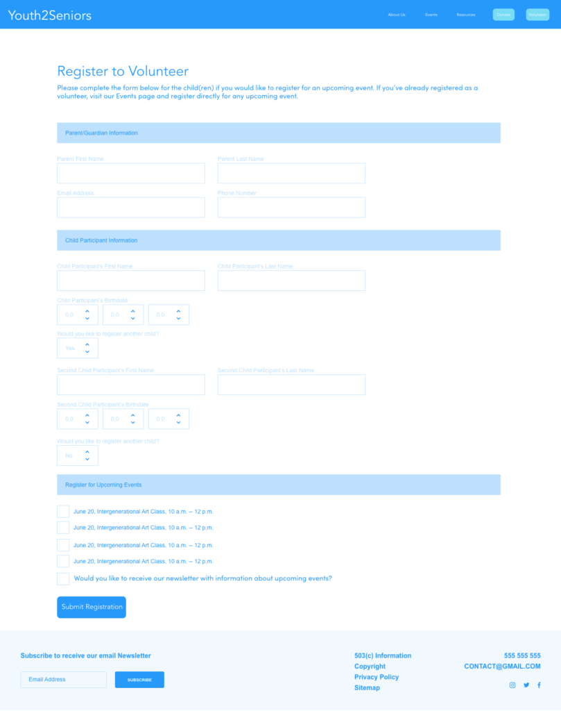
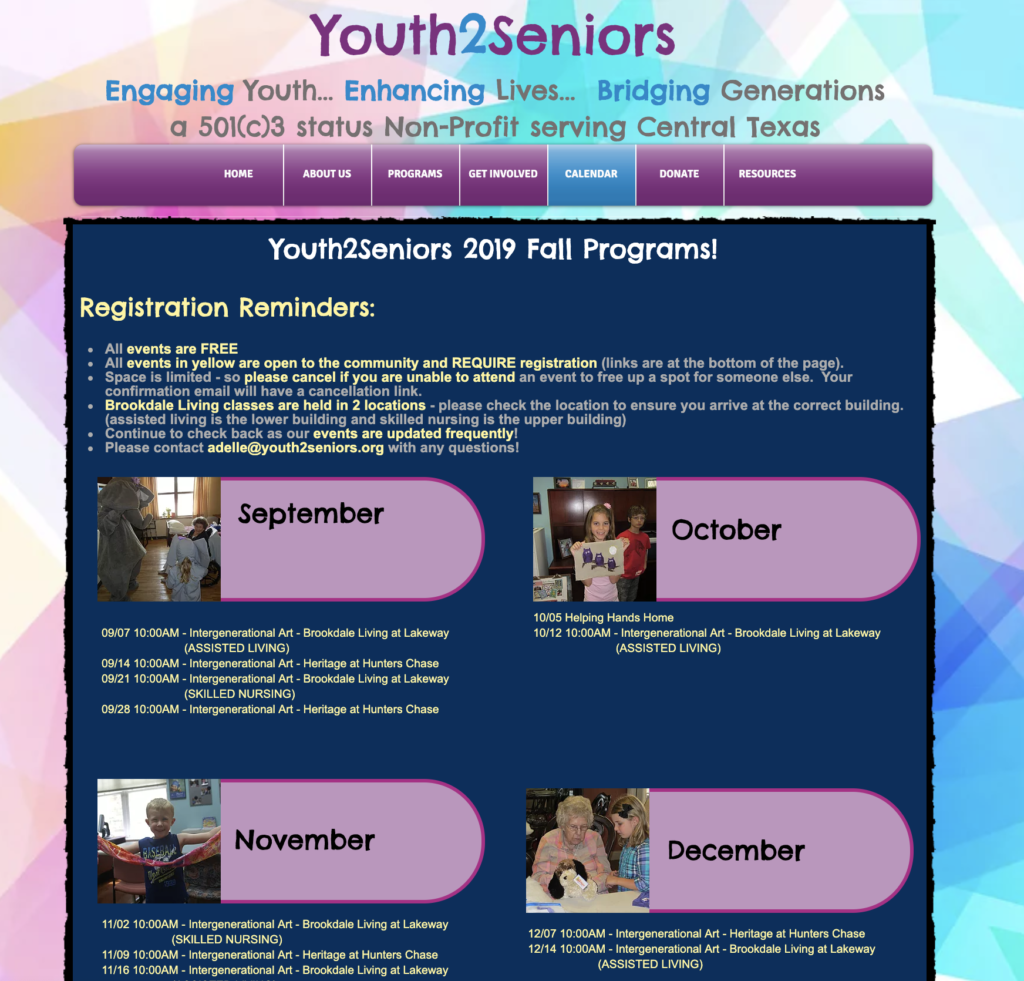
“Their mission isn’t clear. I want to know exactly what I’m going to be doing.”
—A volunteer with Heights and Hills: Supporting Brooklyn’s Older Adults

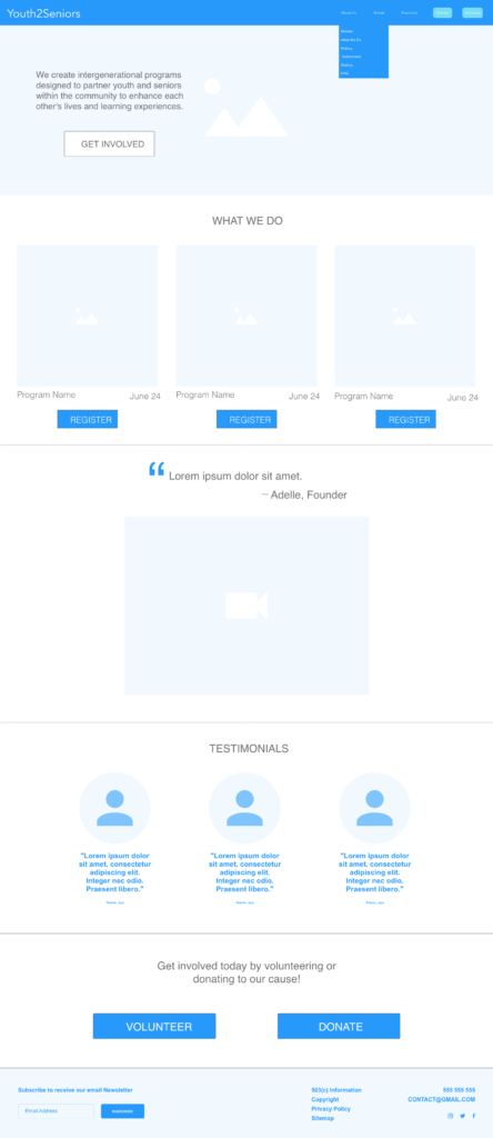
“If I were to stumble on this website while looking for volunteer opportunities for my kids, I’d close the tab immediately because they look like they don’t know what they’re doing.”
—Mom of two kids who volunteer with Generation Serve

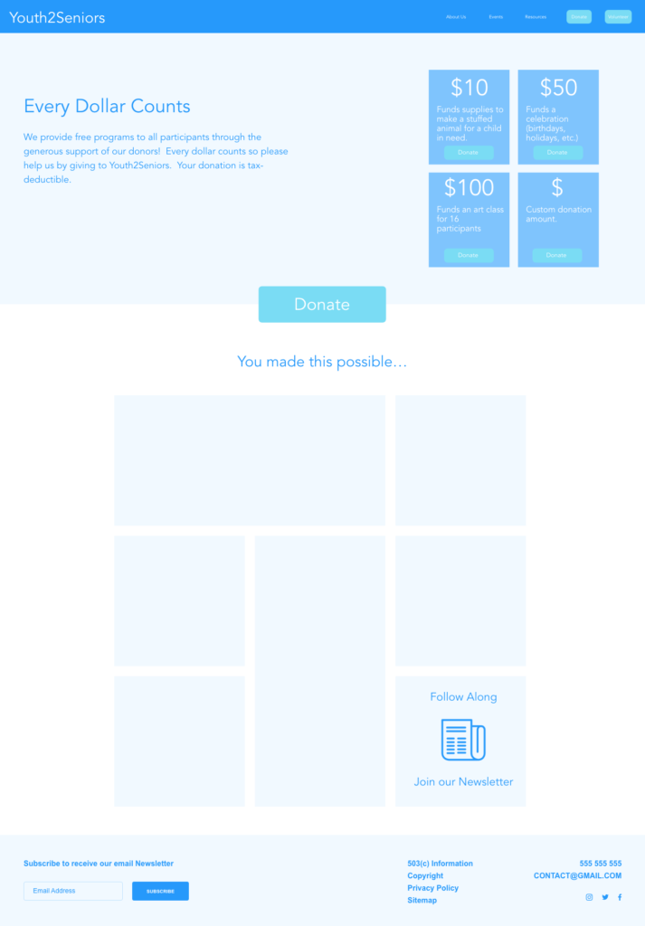
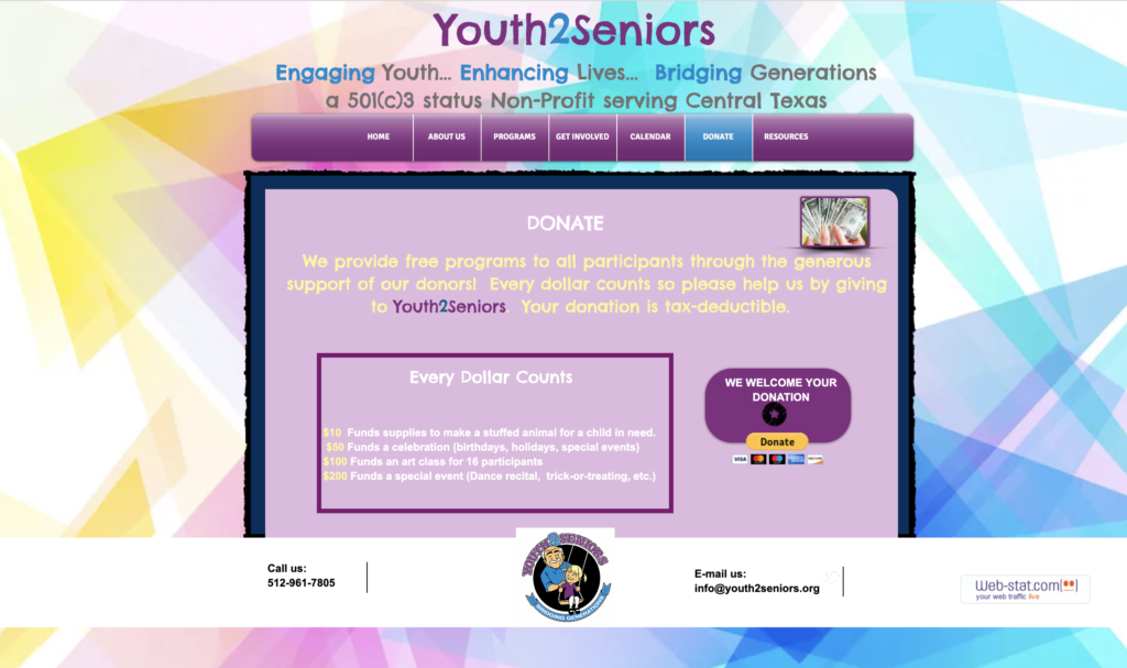
“I’d be afraid to donate money. It looks like a scam.”
— Potential donor

User Persona

Based on our interviews, we created a user persona, Hannah, who we kept in mind through the redesign process.

User Scenario Diagram

In this user scenario diagram, we imagined how Hannah would feel as she looked for a volunteer opportunity for her kids, found Youth2Seniors, and signed her kids up.

Storyboard

Here, we pictured visually how Hannah would find Youth2Seniors, sign her kids up to volunteer, and have a great experience.

Wireframes

After analyzing the existing site and prioritizing features based on what we learned were the biggest user needs, we created a new, improved site map, featuring a much simpler information architecture. We sketched our pages and then created low-fidelity wireframes. In addition to eliminating defunct pages and features, we improved some of the essential ones.

Testing and Iteration

We prototyped our wireframes and conducted user testing, which led to a variety of improvements in our design.

Initial user feedback:

•   Our tagline is too long.
•   “What We Do” is a confusing title for the Upcoming Events section of the homepage.
•   More info is needed in the calendar pop up.
•   The squares on the Donate page look like buttons.
•   Breadcrumbs are unnecessary because our site is fairly flat.

UI Design

Next, we created a style guide. We decided to stick with the color purple to preserve some of the Youth2Seniors brand. We did, however, replace their logo, which people described as “creepy” and slightly misleading in terms of the organization’s mission.

High Fidelity Mockups

Finally, we improved our designs based on our initial user tests, turned our wireframes into hi-fi mockups, and did additional testing, which resulted in further tweaks to our Donation and Calendar pages.

The Homepage

When people arrive to the website, they need to understand what Youth2Seniors does without having to watch a video. We made their mission statement more prominent and emphasized the two CTAS: Volunteer and Donate.

This is what it looked like before!
Redesigned homepage

The What We Do Page

We moved the Programs page into the About Us section and changed “Programs” to “What We Do” because the organization doesn’t just offer programs. We also added sign-up buttons to make it easy for people to participate.

Before
After

The Donation Page

The Donation page desperately needed to look more credible. We made it easier to donate and added photos to show donors their impact.

Before
After

The Calendar Page

The events calendar is a very important feature. We made it easy to see upcoming events. When people click on an event, they get all the necessary details and a convenient sign-up button.

Before
After

The Volunteer Registration Page

We simplified the volunteer registration process by getting rid of unnecessary fields and adding the ability to register multiple kids at one time so that parents don’t have to fill out the same information twice or even three times.

Before
After

Final Thoughts

  • Based on our conversation with the founder and website creator, as well as our preconceived notions, we initially thought it was important to make this website really fun and playful to appeal to kids. Through our interviews with users, however, we learned that a professional-looking website was more important. That insight really underlined the importance of doing proper user research.
  • In our redesign, we cut website features not in use today. If we had more time, we would investigate why people aren’t using those features. Are people not interested? Or, are those features just difficult to find and mired in bad UI?
  • We recommend that Youth2Seniors hires a professional photographer to document some of their events for the website.